Home
These examples are all based on data in the examples folder.
$ cat data.txt
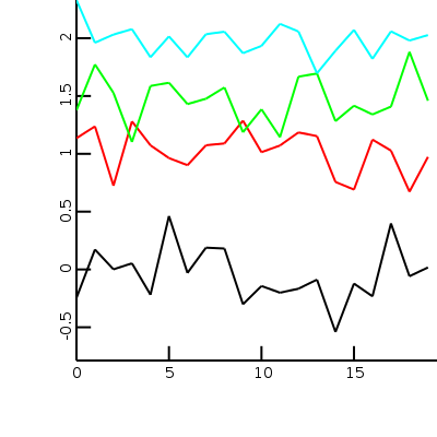
Example that plots four random lines
Use ploctli < data.txt to produce a plotcli.png file
It is possible to define the data format directly from the command line
as well using: plotcli -d ly,ly,ly,ly < data.txt
The l signifies that we are plotting lines. Since no x is specified the line
number is basically used as x variable
#plotcli -d ly,ly,ly,ly
-0.246465,1.1349,1.37636,2.33029
0.17212,1.23672,1.77301,1.96037
0.000651441,0.724035,1.5267,2.03115
0.052469,1.28042,1.10252,2.07756
-0.218561,1.07324,1.58702,1.83484
0.461657,0.96275,1.61422,2.01477
-0.0301995,0.901153,1.42976,1.83419
0.188405,1.07363,1.47592,2.03407
0.180592,1.08957,1.57372,2.05579
-0.301456,1.28647,1.18671,1.86986
-0.143762,1.01361,1.38507,1.93318
-0.201097,1.07135,1.14396,2.12374
-0.166839,1.18496,1.66685,2.05758
-0.0883441,1.15318,1.6945,1.69598
-0.540685,0.7562,1.2825,1.89096
-0.122559,0.690442,1.41562,2.07113
-0.232751,1.12235,1.34008,1.82138
0.397596,1.0274,1.40801,2.05881
-0.0590067,0.672484,1.88119,1.97916
0.0170066,0.973284,1.45928,2.02642
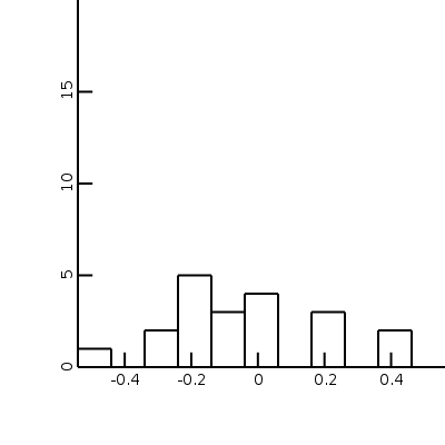
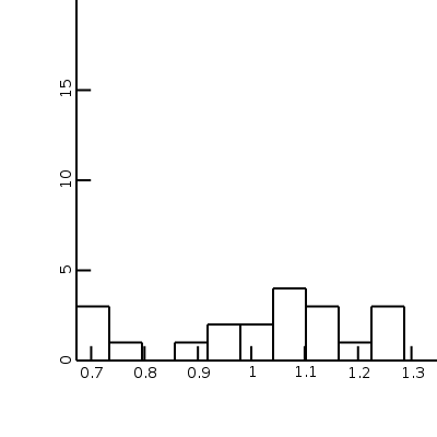
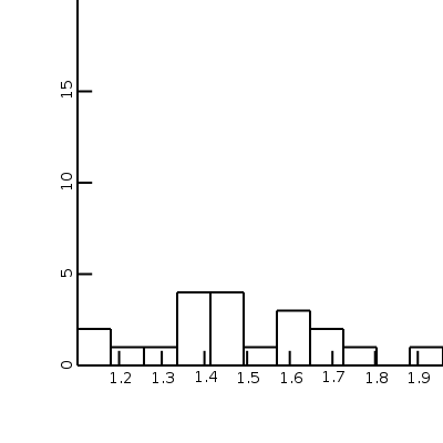
Same data, but now as part of histograms in different plots:
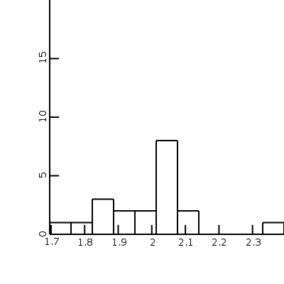
$ cat data.txt
#plotcli -d ha,hb,hc,hd
h signifies a histogram. The letters behind it are figures IDs.
The four different letters here result in four different figures.

-0.246465,1.1349,1.37636,2.33029
0.17212,1.23672,1.77301,1.96037
0.000651441,0.724035,1.5267,2.03115
0.052469,1.28042,1.10252,2.07756
-0.218561,1.07324,1.58702,1.83484
0.461657,0.96275,1.61422,2.01477
-0.0301995,0.901153,1.42976,1.83419
0.188405,1.07363,1.47592,2.03407
0.180592,1.08957,1.57372,2.05579
-0.301456,1.28647,1.18671,1.86986
-0.143762,1.01361,1.38507,1.93318
-0.201097,1.07135,1.14396,2.12374
-0.166839,1.18496,1.66685,2.05758
-0.0883441,1.15318,1.6945,1.69598
-0.540685,0.7562,1.2825,1.89096
-0.122559,0.690442,1.41562,2.07113
-0.232751,1.12235,1.34008,1.82138
0.397596,1.0274,1.40801,2.05881
-0.0590067,0.672484,1.88119,1.97916
0.0170066,0.973284,1.45928,2.02642
Histogram of 2 sets of data and their correlation.
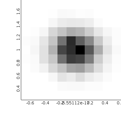
The data file can be found in the examples directory for plotd.
With the id and pn data format options it is also possible to specify data ids/plot names on each row. For example if you have data that looks like this:
experiment1,subexperiment1,type1,0,0.9
experiment1,subexperiment1,type2,0,2.1
experiment1,subexperiment1,type1,1,1.1
experiment1,subexperiment1,type2,1,0
experiment2,subexperiment1,type1,0,0.7
experiment2,subexperiment1,type1,1,1.1
experiment2,subexperiment2,type1,0,9
experiment2,subexperiment2,type1,1,8.1
You can plot it using:
plotcli -d pn,pn,id,x,y < dataFile
and it will create separate image files for each experiment/subexperiment combination and use different colors for each type.