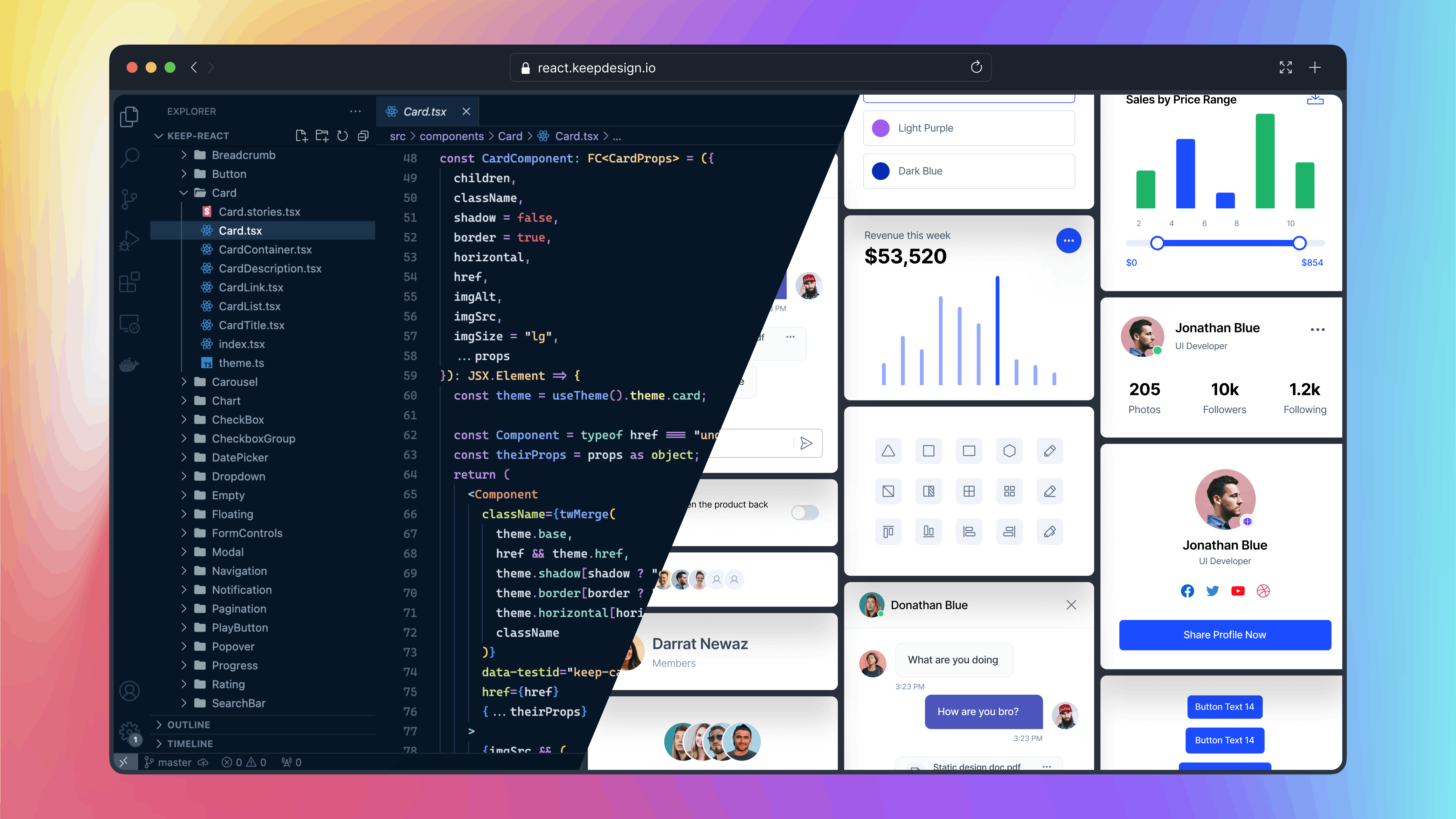
Keep React is an open-source component library built on Tailwind CSS and React.js. It provides a versatile set of pre-designed UI components that enable developers to streamline the creation of modern, responsive, and visually appealing web applications.
Setting Up Keep React in Vite React Application
Step 1: Create a Vite React Application
npm create vite@latest my-project -- --template react
cd my-project
Step 2: Install Tailwind CSS
npm i autoprefixer postcss tailwindcss
npx tailwindcss init -p
Step 3: Install Keep React:
npm i keep-react phosphor-reactOr with Yarn
yarn add keep-react phosphor-reactOr with Pnpm
pnpm add keep-react phosphor-reactStep 4: Go to the tailwind.config.js file and paste the
following code:
import { keepTheme } from 'keep-react/keepTheme'

const config = {
  content: ['./index.html', './src/**/*.{js,ts,jsx,tsx}'],
  theme: {},
}

export default keepTheme(config)
Step 5: Add Tailwind CSS to index.css File:
@import 'keep-react/css';
@tailwind base;
@tailwind components;
@tailwind utilities;You can easily integrate keep-react into your Next.js application.
Step 1: Install Next Js Application
npx create-next-app@latestEnsure that you select tailwindcss as a dependency for your application during the setup.
Would you like to use Tailwind CSS? -- Yes
Step 2: Install Keep React
npm i keep-react phosphor-reactOr with Yarn
yarn add keep-react phosphor-reactOr with Pnpm
pnpm add keep-react phosphor-reactStep 3: Go to the tailwind.config.js file and paste the
following code
import { keepTheme } from 'keep-react/keepTheme'

const config = {
  content: ['./components/**/*.{js,ts,jsx,tsx,mdx}', './app/**/*.{js,ts,jsx,tsx,mdx}'],
  theme: {},
}

export default keepTheme(config)
Step 4: Add Tailwind CSS to globals.css File:
@import 'keep-react/css';
@tailwind base;
@tailwind components;
@tailwind utilities;
Congratulations! You have successfully installed the Keep React. Now you can import any component from keep-react and use it in your project.
import { Button } from 'keep-react'
const App = () => {
  return <Button>Button</Button>
}
export default AppThe Keep React offers a wide range of components to build your user interfaces. For detailed usage and examples of each component, refer to our component documentation.
If you want to contribute to the Keep React, you can follow the contributing guide.
This project exists thanks to all the people who contribute:
If you need access to Figma design files for the components, you can check out our website for more information:
Get access to the Figma design files
The Keep-React name and logos are trademarks of StaticMania.
