Built by Andrew Thompson, Chintan Patel, Daniel Young, Deacon McIntyre, Maegan Kennedy and Tom Brown.
Try the visualisation yourself thanks to GitHub Pages.
The United Nations Sustainable Development Goals data set provides information about a variety of sustainability and developmental metrics for individual countries over the past 20 years. This information is provided by the United Nations in numerical format which makes it difficult for humans to analyse and draw meaning from. By developing a visualisation interface for selected subsections of the available information, we aim to build a system which allows humans to more easily understand, filter, compare and make use of the available information.
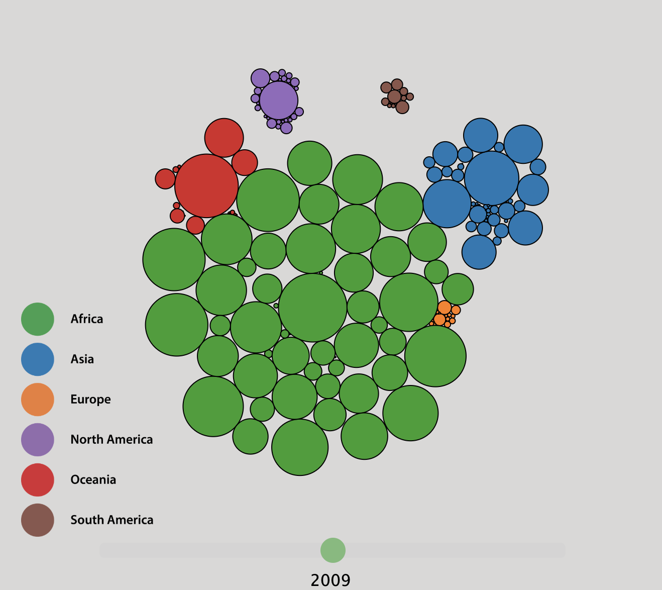
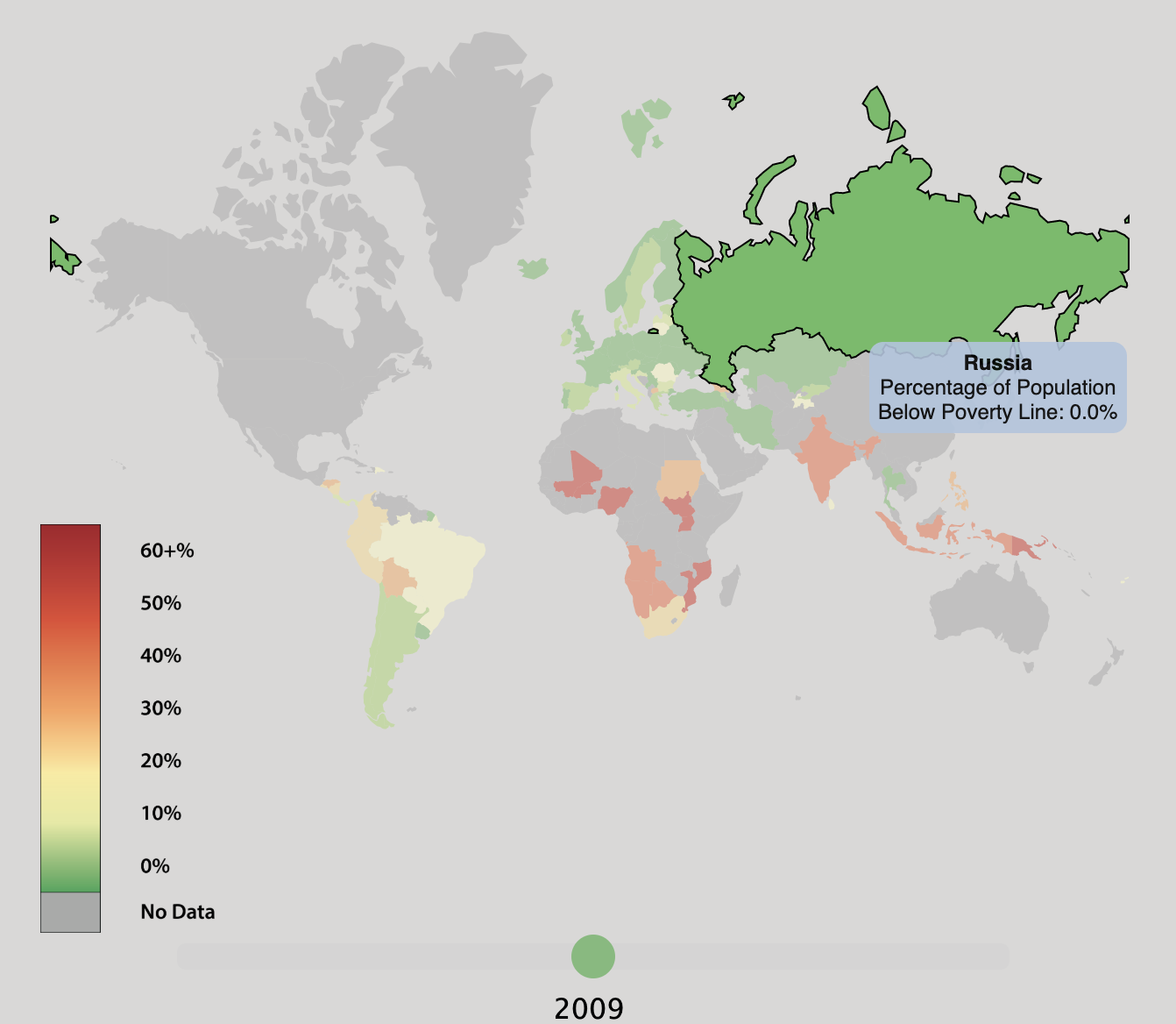
Our visualisation system consists of two separate but related visualisations, both of which are developed using Mike Bostock’s Data-Driven Documents (D3) library. The first visualisation displays the proportion of a country’s population which is living below the poverty line.
The second visualisation displays the proportion of a country’s population without access to basic drinking services (clean water).